Tuesday, 18 July 2017
Fionna Owen has asked us if we would be interested in creating
an exhibition during the first two weeks in September..
The theme should be Middlewich in Summer and Photos should be taken
in July/August 2017.
HOWEVER NO PHOTOS OF THE BOAT & FOLK FESTIVAL (this is a category on its own)
Preferred size is 16 x 20 Ins (standard frame size)
Preferably the photos should be mounted
Posted by Unknown at 7/18/2017 07:40:00 pm
Thursday, 20 April 2017
A little on Landscapes...
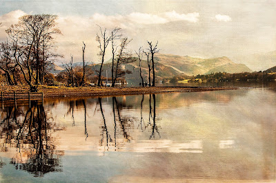
Landscape by Andy Boyle
There was a lot of discussion on focusing for landscape photography last
night. Advice ranged from how to pick up the camera and shoot to how to
plan a shot (that ‘one in a million- “I just happened to be in the right
place at the right time” shot’. ;-) )
I would normally arrange a follow up to answer your questions but the next
two meetings are booked and then we have a summer break. So I have tried
to answer some of the issues here. There are, as we discussed last night,
several different approaches; the main factors being time and experience.
My first recommendation would be – GET THE SHOT! If time is critical then
get the shot, it might just be that ‘one in a million’. If you shoot in
raw then you have some ‘wiggle room’ re. the exposure* but not with the
focus so this is key. The quick, down and dirty answer is to reduce the
aperture size (not number) and set the focus to just below infinity.
This will give you the quickest shot but won’t give you the maximum usable
depth of field** (assuming having everything in focus is your goal).
If you have a foreground that you want to be in focus then you need to
start thinking about focusing on the ‘middle ground’. (“But there is no
‘middle ground” they chorused.) This is the hyperfocal distance that Bill
mentioned last night.
Imagine you are focussed on infinity; the depth of field is then centred
on infinity, with half of it ‘behind’ the subject of your camera. This
means that, although you are technically achieving the longest depth of
field available for your aperture, you are not using it all in your
photograph. Reducing the depth of field but centring it on an area which
is nearer the foreground maximises the amount of your picture which will
fall inside the depth of field and increases your chance of having
everything in focus. Find out more about it here.
Another handy post which also briefly explains the lens diffraction issue
that Andy Boardman mentioned and focus stacking which KenRane spoke about
can be found here.
* Underexpose slightly with DSLR cameras to preserve detail in the shot.
Overexposed (blown out) areas will lose detail but underexposed areas will
have detail that post-processing software can use. Very important for sky
detail. If in doubt then use bracketing.
https://digital-photography-school.com/bracketing-what-is-it-and-what-
to-do-with-the-images/
**To be in focus an item must be within the depth of field which is a
distance that centres around your point of focus. The smaller the aperture
the larger the depth of field.
Useful apps for mobiles:
Apps for calculating hyperfocal distance on iOS
Apps for calculating hyperfocal distance on Android
Compass link for Android
Sunrise/sunset times for Android
Mel :-)
Monday, 6 February 2017
A Little HDR
HDR?
I have been banging on for a while now so I thought I should add something
here..
I know some HDR pics are a bit overdone and can be a bit harsh on the eyes.
This is a easy mistake to make as when you first start playing the the
software you tend to push it to its limits just to see what it can do
(and forget to reset it afterwards) . I must confess that I have done
this myself in the past.
The main reason for using it is to reduce the excessive Highlights and
Shadows that can be found in some pictures. To give a colour boost to a
“Flat” picture I find that can be done with one frame.
Some people also say that it reduces noise in dark areas of a picture..
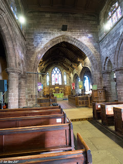
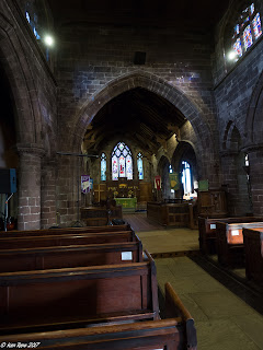
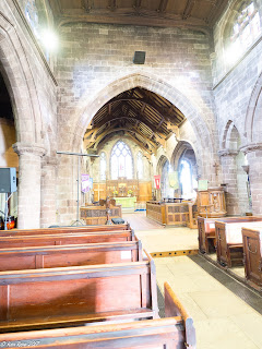
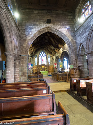
An example of this may be a church interior. Normally the camera will
attempt to meter for the average light and in a church this may give very
dark interiors with correct light from windows or correct light of the
interior with 'Blown Out'* windows.
HDR uses a series of 3/5/7 frames which are the Reference frame with other
frames darker or lighter. Personally I use three frames :- Normal, + 2stops
under exposed & 2 stops over exposed
Many cameras have the “AE Bracketing” function built in so this can be
done automatically (and if you are lucky handheld). If this is not the
case you should use a tripod and:
Go to Aperture priority mode (You need a fixed focal length.
The shutter speed will vary.)
1 Take a normal picture
2 Set the exposure adjustment to -2 stops and take a pic
3 Set the exposure adjustment to +2 stops and take a pic
If you check the pics on your LCD you should have something like
the following :-
 Normal
 Underexposed by -2 stops
 Over exposed by +2 stops.
Perhaps the easiest way of processing the HDR pics is lightroom..
All you have to do is highlight the three pictures and press CTL H
(CMD H on a mac I believe) or “Photo”, “Photomerge”, “HDR”
This will go to the HDR preview screen. On the side of the screen are
a couple of tick boxes.
Make sure the auto align box is ticked as this will attempt to correct
for movements of the camera.
The other option is for ghosting – this is for anything that might move
in the picture (between the 3 frames). I would recommend setting to either
“None” or “low” - This should reduce the processing time required.
If there is a large amount of pink areas on the preview set the ghosting
higher.
Once you have done this press “Merge” and it will take a short time to
process the picture depending on your pc. Once complete it will return to
the normal Lightroom screen..
The processed frame might not be visible right away as the you are looking
at imported files. You will have to go to your normal “Library” view of
the folder
Over exposed by +2 stops.
Perhaps the easiest way of processing the HDR pics is lightroom..
All you have to do is highlight the three pictures and press CTL H
(CMD H on a mac I believe) or “Photo”, “Photomerge”, “HDR”
This will go to the HDR preview screen. On the side of the screen are
a couple of tick boxes.
Make sure the auto align box is ticked as this will attempt to correct
for movements of the camera.
The other option is for ghosting – this is for anything that might move
in the picture (between the 3 frames). I would recommend setting to either
“None” or “low” - This should reduce the processing time required.
If there is a large amount of pink areas on the preview set the ghosting
higher.
Once you have done this press “Merge” and it will take a short time to
process the picture depending on your pc. Once complete it will return to
the normal Lightroom screen..
The processed frame might not be visible right away as the you are looking
at imported files. You will have to go to your normal “Library” view of
the folder
 Initial Result of HDR process
At first glance the picture does not look greatly different from your
reference image but you now have a greater dynamic range of colours and
controls available to you..
By reducing the Highlights & White sliders you should be able to fix that
“Blown Out” window and the Shadow & Dark sliders should improve the darker
areas of the picture.
The vibrance and saturation sliders will allow you to control the colour
(along with the other colour controls)
Also remember these controls can be applied locally by the filters and
correction brush as well!
Initial Result of HDR process
At first glance the picture does not look greatly different from your
reference image but you now have a greater dynamic range of colours and
controls available to you..
By reducing the Highlights & White sliders you should be able to fix that
“Blown Out” window and the Shadow & Dark sliders should improve the darker
areas of the picture.
The vibrance and saturation sliders will allow you to control the colour
(along with the other colour controls)
Also remember these controls can be applied locally by the filters and
correction brush as well!
 After processing
Photoshop
I believe there are two ways of processing HDR files in Photoshop.
As I am not a PS expert I will give the most straightforward.
Open P.S.
“Files”
“Automate”
“Merge to HDR PRO”
You will be prompted to open your pictures and then a 'Processing Dialogue'
will open on the screen.
Photomatix is a HDR processing program that can act as a stand-alone or
a Lightroom plug-in
You can download a trial version to play with but this will put a
watermark on any pictures it creates. These can be removed by purchasing
a license.
HDRefex Pro is part of Google's free (NIK collection) designed to act as
a plug-in to LR or PS.
With a little playing around it is possible to run this as a stand-alone
program (run the exec file from within the program files folder).
Ken
*Blown out -An area where the image appears bright white and the camera
hasn't stored detail that may have been available to the naked eye.
Thursday, 15 December 2016
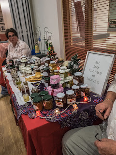
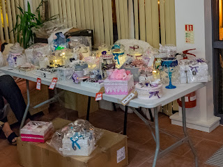
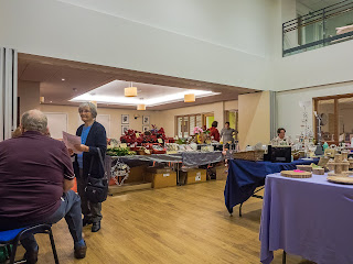
Middlewich's Craft Fair - Great stalls - you can still catch 'em all
After processing
Photoshop
I believe there are two ways of processing HDR files in Photoshop.
As I am not a PS expert I will give the most straightforward.
Open P.S.
“Files”
“Automate”
“Merge to HDR PRO”
You will be prompted to open your pictures and then a 'Processing Dialogue'
will open on the screen.
Photomatix is a HDR processing program that can act as a stand-alone or
a Lightroom plug-in
You can download a trial version to play with but this will put a
watermark on any pictures it creates. These can be removed by purchasing
a license.
HDRefex Pro is part of Google's free (NIK collection) designed to act as
a plug-in to LR or PS.
With a little playing around it is possible to run this as a stand-alone
program (run the exec file from within the program files folder).
Ken
*Blown out -An area where the image appears bright white and the camera
hasn't stored detail that may have been available to the naked eye.
Thursday, 15 December 2016
Middlewich's Craft Fair - Great stalls - you can still catch 'em all
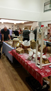 Derek Lomas's woodturning and Paul Shipley's bird houses
So the festive music was in full swing and the hall was full of amazing
stalls all displaying seasonal goods and more. Rarely had Middlewich seen
such fayre but did you miss it?
Don't worry, there is still a chance to catch up. There are links to the
stalls here which will allow you to catch up and grab a bargain or two
just in time for Christmas!
Amanda Owen
Middlewich Crafts
Helen Ireland (Local Body Shop representative), also at Willowmere
Laura Estcourt's cakes
Julie Shannon's brooches etc.
Pintail jewellery
Paul Shipley's bird houses
Derek Lomas's woodturning
Personalise your canvas
Aspire Global (Jenni)
Northlands' Naturals (new page, photos soon)
If I have missed you out or you have a preferred link then just let me
know by messaging @NorthlandsNaturals
Derek Lomas's woodturning and Paul Shipley's bird houses
So the festive music was in full swing and the hall was full of amazing
stalls all displaying seasonal goods and more. Rarely had Middlewich seen
such fayre but did you miss it?
Don't worry, there is still a chance to catch up. There are links to the
stalls here which will allow you to catch up and grab a bargain or two
just in time for Christmas!
Amanda Owen
Middlewich Crafts
Helen Ireland (Local Body Shop representative), also at Willowmere
Laura Estcourt's cakes
Julie Shannon's brooches etc.
Pintail jewellery
Paul Shipley's bird houses
Derek Lomas's woodturning
Personalise your canvas
Aspire Global (Jenni)
Northlands' Naturals (new page, photos soon)
If I have missed you out or you have a preferred link then just let me
know by messaging @NorthlandsNaturals
 Monday, 7 November 2016
Christmas Shopping Event
Monday, 7 November 2016
Christmas Shopping Event
 Tuesday, 14 June 2016
Our first exhibition!
It is finally here! Our very first exhibition.
It has been hectic to get it in place once the group decided to go for it,
but well worth it! I hope you get a chance to pop down and check it out
(details below).
The idea of printing out work for a display was quite daunting and
challenging for group members for several different reasons. Is my work
good enough? Will it look good in print? What type of file should be used?
What quality is required? How do I share large files? All questions that
members of the group have been asking and discussing recently.
I hope that most of you have gained some new knowledge and insight into
this process. It has certainly helped me identify some areas where the
group could do with more education and Phil Tomlinson is on the case with
that already :-)
What a great way to end the group year. Our last evening meeting is the
AGM then we have several group outings coming up over the summer and our
evening meetings recommence in September.
See you all on the 17th,
Mel
Tuesday, 14 June 2016
Our first exhibition!
It is finally here! Our very first exhibition.
It has been hectic to get it in place once the group decided to go for it,
but well worth it! I hope you get a chance to pop down and check it out
(details below).
The idea of printing out work for a display was quite daunting and
challenging for group members for several different reasons. Is my work
good enough? Will it look good in print? What type of file should be used?
What quality is required? How do I share large files? All questions that
members of the group have been asking and discussing recently.
I hope that most of you have gained some new knowledge and insight into
this process. It has certainly helped me identify some areas where the
group could do with more education and Phil Tomlinson is on the case with
that already :-)
What a great way to end the group year. Our last evening meeting is the
AGM then we have several group outings coming up over the summer and our
evening meetings recommence in September.
See you all on the 17th,
Mel
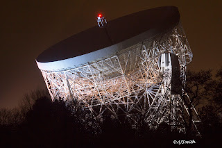 Jodrell Bank by Alan Smith
Check this out!
A local camera group, 21st Century Technology and Camera group, have
organised an exhibition in Middlewich’s ‘Art and Frames’ shop, next door
to the Pet Shop on Wheelock Street. It is on for a fortnight starting
today (14/6/16), so don’t be shy - do pop in and have a look. There is
a wide range of subjects including local scenes and wildlife.
Please go to our website http://www.watch-it-and-c.co.uk/ to find out
more about the group.
Many thanks to
Personalise Your Canvas Cheshire
https://www.facebook.com/personalcanvas/?fref=nf for their printing skills.
Monday, 12 October 2015
Is your photo a 3-course meal or an appetiser?
It seems so simple...you look at a photo and hit 'like' but why?
What is it that makes you like a picture more than another?
There are the obvious social reasons involved, but I am talking about
real appreciation here. What is it that draws your attention?
Are you a sucker for technical expertise and experience, because sometimes
it just shines through? Do you love or hate HDR? (It seems to be that you
either belong in one camp or another.) Do you like a picture that tells a
story? Brings back a memory? Makes you stop, take a coffee and just look?
Maybe you're just greedy and you expect a little of everything?
As a photographer do you try to create your 'perfect' image? Do you
specialise in a 'comfort' zone or do you experiment and try to push your
boundaries when you are behind the camera? However you approach your
photography an understanding of what makes the difference between a good
photo and a great one is important and could be argued over many a pint,
but understanding what it is that makes a photo work for you?
That's something we all need to be able to accomplish - to look at a
photo and understand what it is that makes it stand out from the crowd
for you.
Jodrell Bank by Alan Smith
Check this out!
A local camera group, 21st Century Technology and Camera group, have
organised an exhibition in Middlewich’s ‘Art and Frames’ shop, next door
to the Pet Shop on Wheelock Street. It is on for a fortnight starting
today (14/6/16), so don’t be shy - do pop in and have a look. There is
a wide range of subjects including local scenes and wildlife.
Please go to our website http://www.watch-it-and-c.co.uk/ to find out
more about the group.
Many thanks to
Personalise Your Canvas Cheshire
https://www.facebook.com/personalcanvas/?fref=nf for their printing skills.
Monday, 12 October 2015
Is your photo a 3-course meal or an appetiser?
It seems so simple...you look at a photo and hit 'like' but why?
What is it that makes you like a picture more than another?
There are the obvious social reasons involved, but I am talking about
real appreciation here. What is it that draws your attention?
Are you a sucker for technical expertise and experience, because sometimes
it just shines through? Do you love or hate HDR? (It seems to be that you
either belong in one camp or another.) Do you like a picture that tells a
story? Brings back a memory? Makes you stop, take a coffee and just look?
Maybe you're just greedy and you expect a little of everything?
As a photographer do you try to create your 'perfect' image? Do you
specialise in a 'comfort' zone or do you experiment and try to push your
boundaries when you are behind the camera? However you approach your
photography an understanding of what makes the difference between a good
photo and a great one is important and could be argued over many a pint,
but understanding what it is that makes a photo work for you?
That's something we all need to be able to accomplish - to look at a
photo and understand what it is that makes it stand out from the crowd
for you.
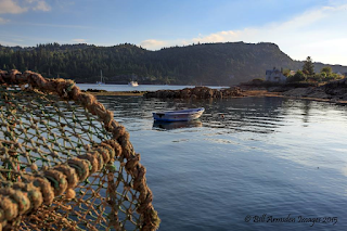 A couple of favourites that I have seen recently appealed to me for
completely different reasons. This first one, a landscape by photographer
Bill Armsden struck a chord for me. It worked for the simple reason that
it is complete. It's foreground, mid-ground and background is a full
three course meal. Each one leading on to the next, guiding the 'consumer'
to fulfilment; From the lobster pot, with its rope wrapped frame pointing
to the boat and the boat aimed neatly at the house, each item fitting
into a classic 'rule of thirds' composition. Add in the perfect
combination of late summer colours and it works.
A couple of favourites that I have seen recently appealed to me for
completely different reasons. This first one, a landscape by photographer
Bill Armsden struck a chord for me. It worked for the simple reason that
it is complete. It's foreground, mid-ground and background is a full
three course meal. Each one leading on to the next, guiding the 'consumer'
to fulfilment; From the lobster pot, with its rope wrapped frame pointing
to the boat and the boat aimed neatly at the house, each item fitting
into a classic 'rule of thirds' composition. Add in the perfect
combination of late summer colours and it works.
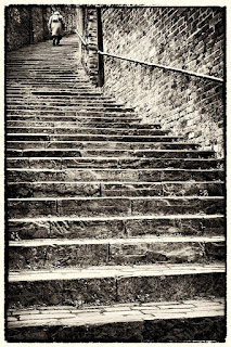 That first choice was an unusual one for me as I am not a great landscape
fan. I tend to prefer images that form part of a story or evoke emotions
and this is exactly where my next choice comes in. A picture that a
friend, photographer Mike Finley, has recently put up for sale at an
exhibition. Entitled 'The Long Climb', it is the perfect 'snapshot' of
someone's life. Who is she? Who does she represent? What has she
experienced? What was her 'Climb' and where will it end? I think the
decision to show it in black and white is just perfect and the rough edge
used enhances rather than detracts from the image. Her position on the
steps is just perfect too. She clearly has seen a lot of life go by but
there is still more to come. I would so love this to be part of a set,
with a child at the lower end of the steps but that in itself would raise
so many questions. Should it have colour? I would be drawn to a colourful
children's dress in yellow with a large daisy print, with the rest in
black and white but would have to see it to be sure. It also gives rise
to the question should there be an image of a mother with her children
halfway up the steps, giving a 'Three Ages of Woman' effect (á la Klimt)?
Just the fact that the original image gives rise to these questions is
probably enough and if the other images are staged (as they almost
certainly would have to be), it would take away from the candid nature of
the original shot.
There are a whole set of wonderful images here (click on link) that I
could discuss but will leave you to review and comment on below.
Personally I love the cleverness of the title, "Mite Walking in Frog
Valley" and the 12-18 year old entry (Just how did a 16 year old produce
such a perfect example of bokeh?) But I would love to hear your comments.
Mel
That first choice was an unusual one for me as I am not a great landscape
fan. I tend to prefer images that form part of a story or evoke emotions
and this is exactly where my next choice comes in. A picture that a
friend, photographer Mike Finley, has recently put up for sale at an
exhibition. Entitled 'The Long Climb', it is the perfect 'snapshot' of
someone's life. Who is she? Who does she represent? What has she
experienced? What was her 'Climb' and where will it end? I think the
decision to show it in black and white is just perfect and the rough edge
used enhances rather than detracts from the image. Her position on the
steps is just perfect too. She clearly has seen a lot of life go by but
there is still more to come. I would so love this to be part of a set,
with a child at the lower end of the steps but that in itself would raise
so many questions. Should it have colour? I would be drawn to a colourful
children's dress in yellow with a large daisy print, with the rest in
black and white but would have to see it to be sure. It also gives rise
to the question should there be an image of a mother with her children
halfway up the steps, giving a 'Three Ages of Woman' effect (á la Klimt)?
Just the fact that the original image gives rise to these questions is
probably enough and if the other images are staged (as they almost
certainly would have to be), it would take away from the candid nature of
the original shot.
There are a whole set of wonderful images here (click on link) that I
could discuss but will leave you to review and comment on below.
Personally I love the cleverness of the title, "Mite Walking in Frog
Valley" and the 12-18 year old entry (Just how did a 16 year old produce
such a perfect example of bokeh?) But I would love to hear your comments.
Mel
|